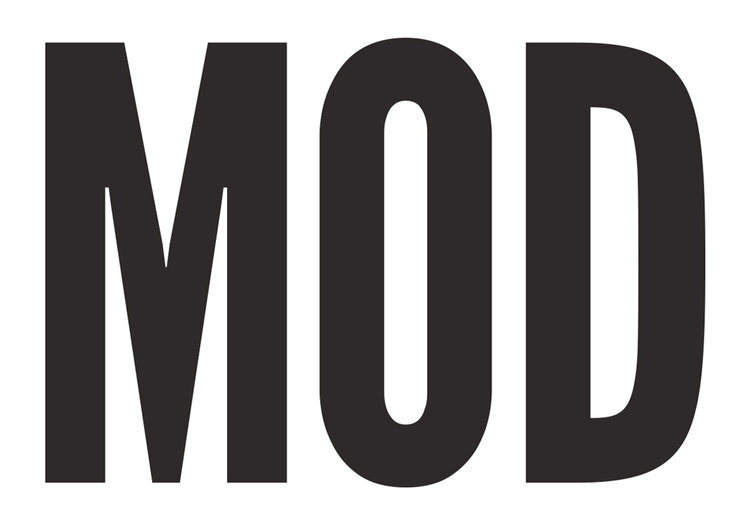
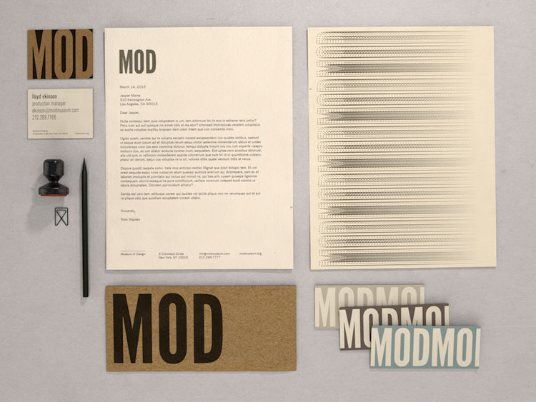
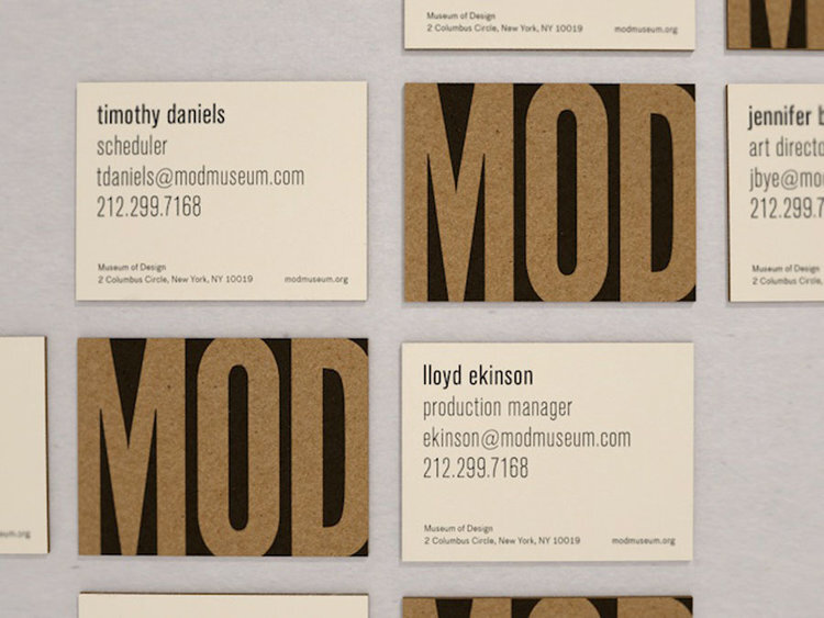
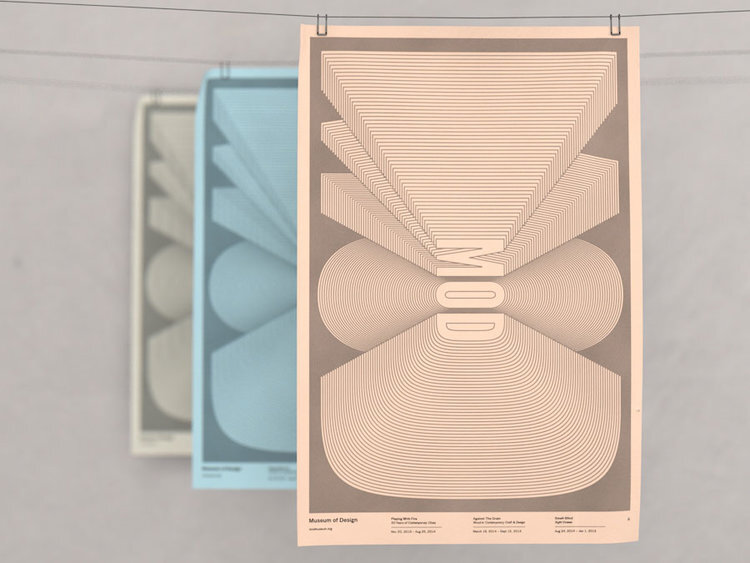
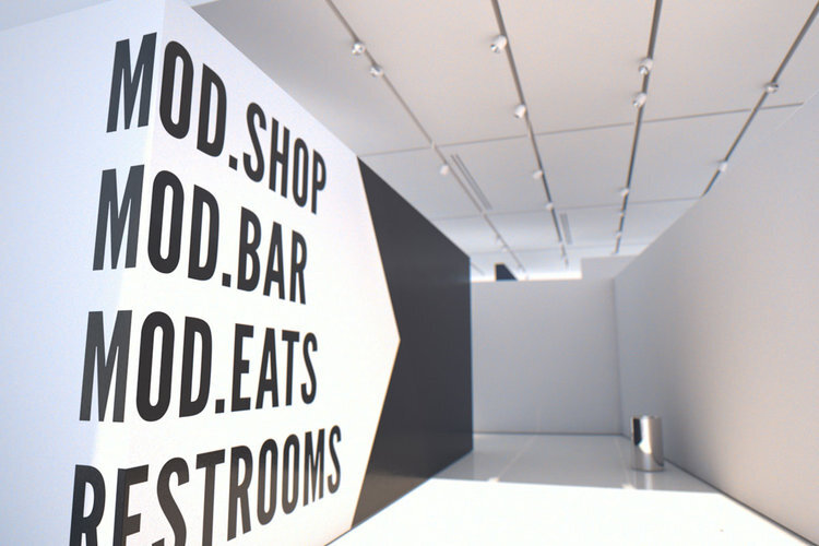
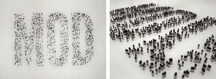
Museum of Design
Identity proposal for the Museum of Art & Design (NYC).
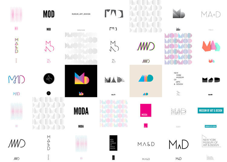
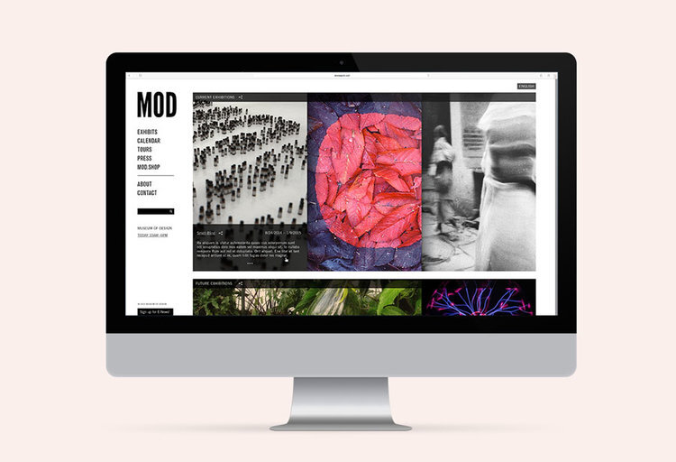
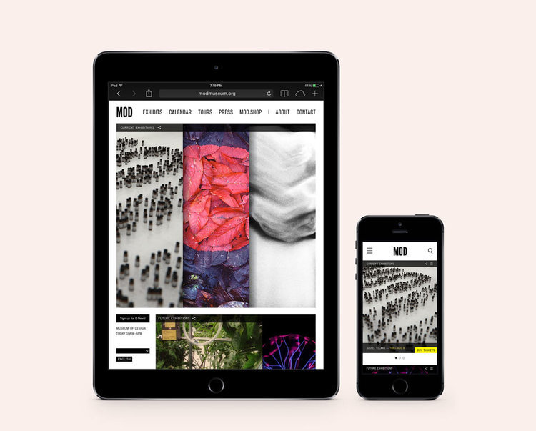
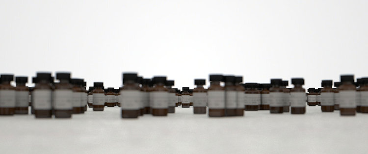
This series explores the museum's possible rebrand and identity collateral. In addition, I created a proposal interactive smell exhibition called "Smell-Blind" to showcase works of smell artist Sissel Tolass. Smell-Blind was designed to introduce visitors to the idea of seeing with your nose.
Concept, Graphics, Layout | Me
Mentors | Brad Bartlett & Paul Hoppe